CATEGORY
Web Design
YEAR
ROLE
UX/UI Designer
TEAM
Solo

The idea started at Museum SAN, inside Ground, an installation by Antony Gormley set in an underground dome designed by Tadao Ando. Rusted iron figures stand across the space with no facial expressions, but their posture alone communicates emotion. Visitors often start mimicking the poses without being told to.
That raised a question I couldn't stop thinking about: could a digital space create that same kind of emotional interaction through the body, even when people are physically apart?
Most interactive art depends on being physically present, on scale, space, and shared bodily experience. That leaves people out if they can't access the exhibit because of location, cost, or time. Online, art usually becomes a static image or video, and a lot of the emotional impact gets lost.
How might we create emotional, embodied connection between people who are physically apart?

Add additional project content here.

I combined a literature review on digital interaction and computer-mediated communication with a closer look at Gormley's own artistic approach. Three things stood out:
People engage more emotionally when they can sense the presence of others, not just experience something alone
Empathy is possible in digital spaces, technology itself isn't the barrier, the design of the interaction is what determines whether emotion comes through
Gormley's figures show that emotion doesn't need language or facial expression. Posture and spatial presence are enough
Key insight: if people can sense others' presence, see emotional states rendered visibly, and express themselves through their body instead of text, digital spaces can carry real emotional weight.

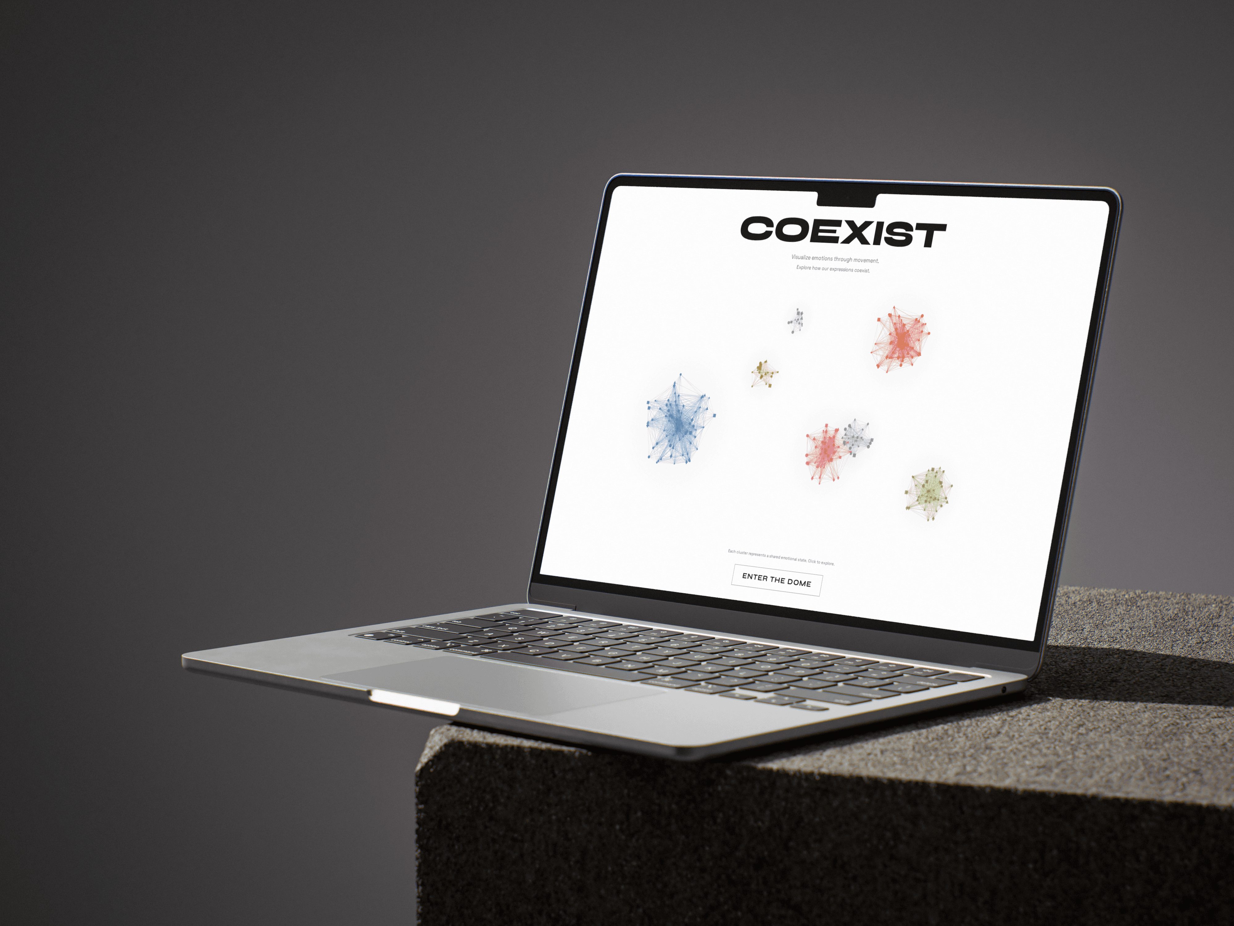
Coexistence Dome opens with emotional clusters floating on the landing page, organic particle shapes in different colors, each one representing a shared emotional state that other visitors have already contributed. Hovering over a cluster reveals the emotions inside it before you even enter.
Clicking "Enter the Dome" leads into the actual experience: a real photo of a rusted iron sculpture, paired with the instruction to physically mimic its pose. Shift + Enter starts the interaction. Instead of typing how you feel or picking an emoji, you're asked to embody it first.
After mimicking the pose, you share what you felt in a short reflection, tagged with an emotion (Joy, Isolation, Connection, Uncertainty, Longing) alongside a written line, like "We are the same underneath" or "It reminded me of my parents." Every submission joins the growing cluster on the landing page, so new visitors see the accumulated emotional landscape left by everyone before them. The site supports Korean, English, French, and Japanese, so the shared emotional space isn't limited to one language.

After building it, I ran usability tests. The biggest piece of feedback was that the instructions weren't clear. People weren't sure what they were supposed to do when they landed on the page.
My first instinct was to keep text minimal so it wouldn't overwhelm the experience. But cutting explanation was actually making the interaction harder to enter, not more elegant. I added more detailed instructions, and it worked. That changed how I think about text-heavy interfaces: the problem was never the amount of text, it was whether it showed up in the right place at the right moment.
After building it, I ran usability tests. The biggest piece of feedback was that the instructions weren't clear. People weren't sure what they were supposed to do when they landed on the page.
My first instinct was to keep text minimal so it wouldn't overwhelm the experience. But cutting explanation was actually making the interaction harder to enter, not more elegant. I added more detailed instructions, and it worked. That changed how I think about text-heavy interfaces: the problem was never the amount of text, it was whether it showed up in the right place at the right moment.
After building it, I ran usability tests. The biggest piece of feedback was that the instructions weren't clear. People weren't sure what they were supposed to do when they landed on the page.
My first instinct was to keep text minimal so it wouldn't overwhelm the experience. But cutting explanation was actually making the interaction harder to enter, not more elegant. I added more detailed instructions, and it worked. That changed how I think about text-heavy interfaces: the problem was never the amount of text, it was whether it showed up in the right place at the right moment.
After building it, I ran usability tests. The biggest piece of feedback was that the instructions weren't clear. People weren't sure what they were supposed to do when they landed on the page.
My first instinct was to keep text minimal so it wouldn't overwhelm the experience. But cutting explanation was actually making the interaction harder to enter, not more elegant. I added more detailed instructions, and it worked. That changed how I think about text-heavy interfaces: the problem was never the amount of text, it was whether it showed up in the right place at the right moment.
AI didn't replace my design process here, it let me move faster through interaction ideas so I could spend more time on the actual experience. As AI tools get more integrated into design workflows, I think they'll let designers prototype stranger, more speculative interactions faster, not just execute known patterns quicker. This project ended up being as much about testing that as it was about the emotional interaction itself.